Logo Design: Perennial Pages Concept Logo*
*This logo was a concept design for a fictional used book store to illustrate my design process and the care I give to client projects.
Perennial Pages
Giving old books new life season after season
Perennial Pages has a comfortable, cozy cottage garden feel. Chairs and benches are scattered around the store for browsers, and beverages are available at the cafe.

Project Brief
Perennial Pages is a used bookstore catering especially to women who love classic literature. They need a logo that reflects their company values and the experience they create for their customers.
- Company Type: Book Store
- Company Details: A used book store giving books new life season after season.
- Target Audience: Most customers are women over 30, with an interest in the classics and other literature. A children’s section allows parents and nannies to enjoy a book and a beverage on their break while the children play.
- Mood and Characteristics:
- Cozy and warm. Relaxing.
- Classic and welcoming – cozy cottage garden.
- Company Name: Perennial Pages
- Company Tagline: Giving old books new life season after season!
Design Process
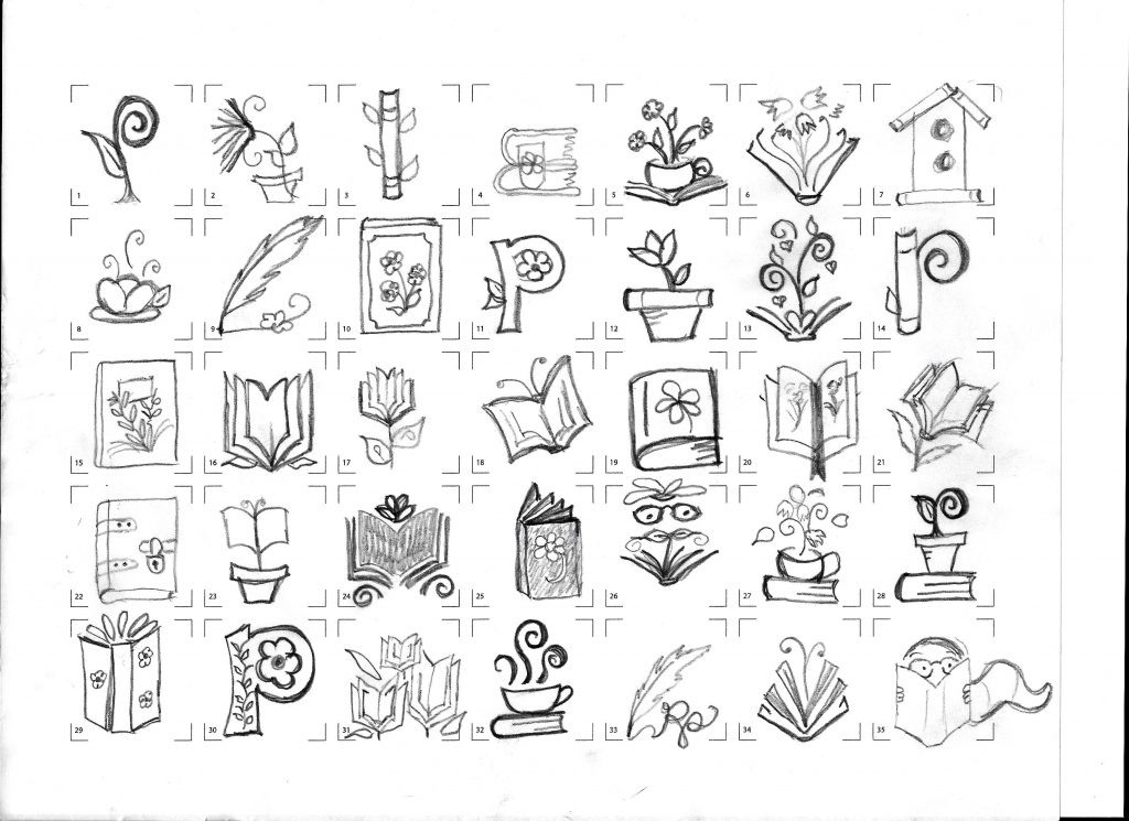
After researching and listing words that reflect both the purpose and the aesthetic of the company, a set of initial thumbnail sketches were created to explore possible logo ideas. The most promising ideas were refined in further sketches


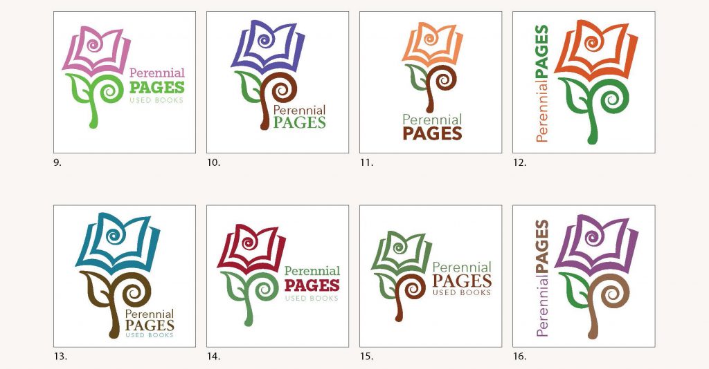
In the final design, the stem creates a “P” to visually echo the name of the bookstore. The petals of the flower form the shape of an open book. Further, the repetition in lines and shapes visually unites the separate elements into a flower shape evocative of a cottage garden.

Because there were not branding guidelines in place, I was able to explore various color and font combinations. In the end, traditional rose colors captured the feel of a cottage garden. A slab-serif font gave the logo an updated feel while maintaining comfortable, traditional lines.
