Children's Recipe App Design*
*This app design was a concept design for a fictional recipe app to illustrate my design process and the care I give to client projects.
Simple Smoothie
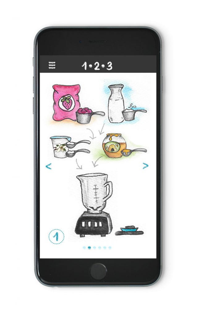
A clear and simple recipe with no written instructions

Purpose
The purpose of this exercise was to explore various visual methods to convey clear instructions to the user without the use of words. The final result needed to fit the style of the app with approachable, hand-drawn illustrations.
The audience for this project was young users with little cooking experience. Ingredients needed to be easy to identify from the images. The recipe was broken down into several steps so that users could focus on one task at a time.
Design Process
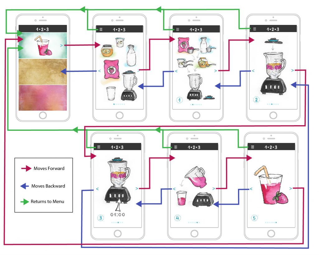
While it was important that the recipe be easily understood by the user, it was equally important that the navigation was intuitive. Mapping the navigation visually allowed us to ensure that it was easy to navigate through the recipe.

Refinements
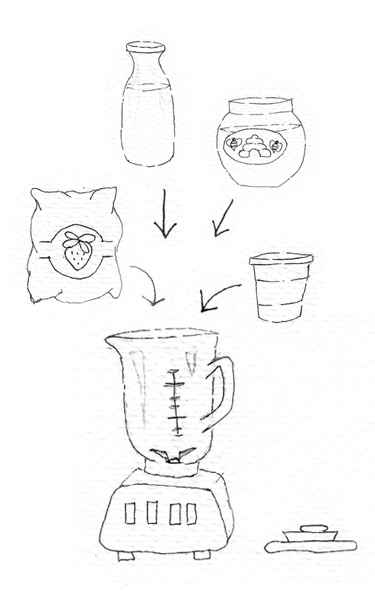
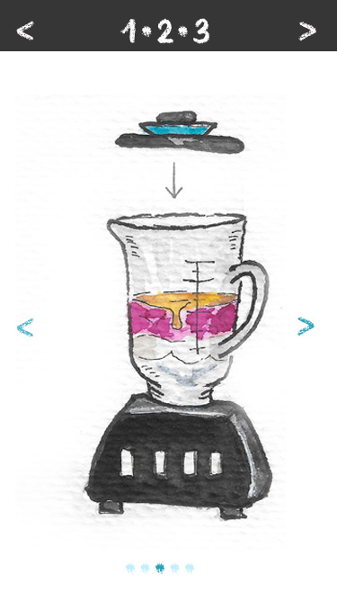
One of the most important stages of the design process is user-testing and refinement. From the initial prototype, improvements were made to both the illustrations and the navigation to improve the user experience.
- Initial Menu Navigation: User testing revealed that simply clicking on the recipe image to access the recipe wasn’t intuitive. A button indicator was added to the image. Dots were added to the bottom of each page so that user’s can track their location in the recipe more easily.
- Illustrations: A few ingredients were difficult to identify. Adding color was one suggestion to improve the ability to identify each item. The yogurt container was also updated with a tab top rather than a lid to make it more recognizable for the younger audience.
- Movement Illustration: Arrows were added to show motion in illustrations that were unclear to the users.


